Custom Ink &More Campaign Design
Task: The design team was tasked to work out how the campaign language would be designed, as well as the art and photography.
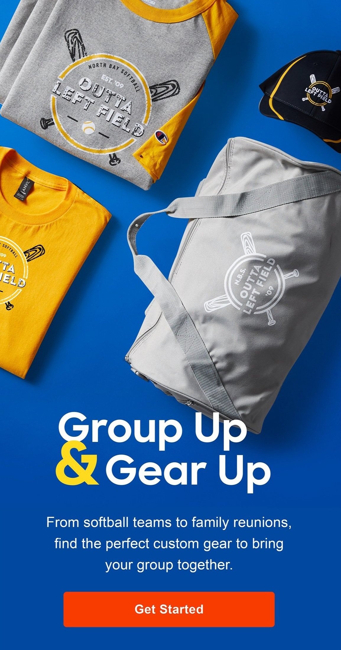
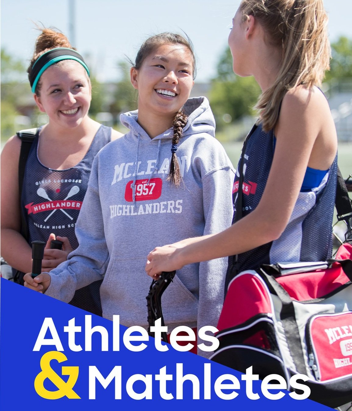
Challenge: The visual spacing with the ampersand did not flow well as it was in normal sentence form and the team had some difficulty create layouts that were visually appealing for the campaign.
Solution: So I proposed enlarging the ampersand to create emphasis and to help create a lock up that could quickly read and catch eye of viewers.